MALAKOFF HUMANIS / HEALTH MEMBER PORTAL / 2020-2023
Making reimbursements and requests easier to follow.
Members needed to understand their reimbursement and know which document to submit.
My design decision. Calls to customer support prompted a review of the upload flow. I prototyped a heading for one document and a “Next” action when several were needed.
I analysed how members used the portal and designed the journeys. I worked with UI designers and the IT team through implementation.
In an overall survey of 120 respondents, 92% were satisfied with how well they understood their reimbursement and coverage.
Separate the amount reimbursed from what’s still owed.
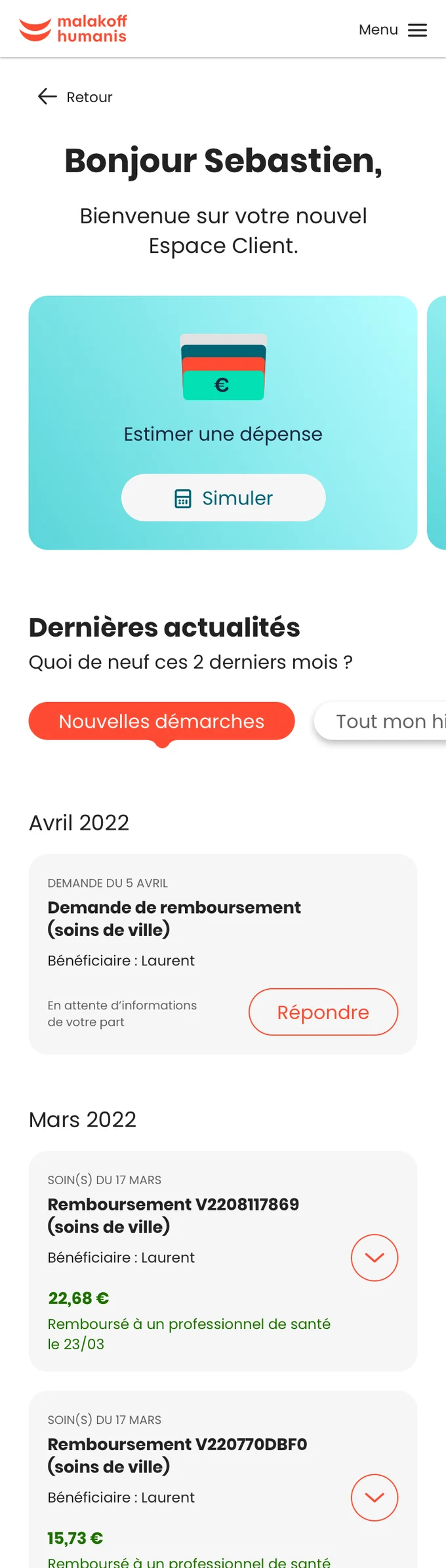
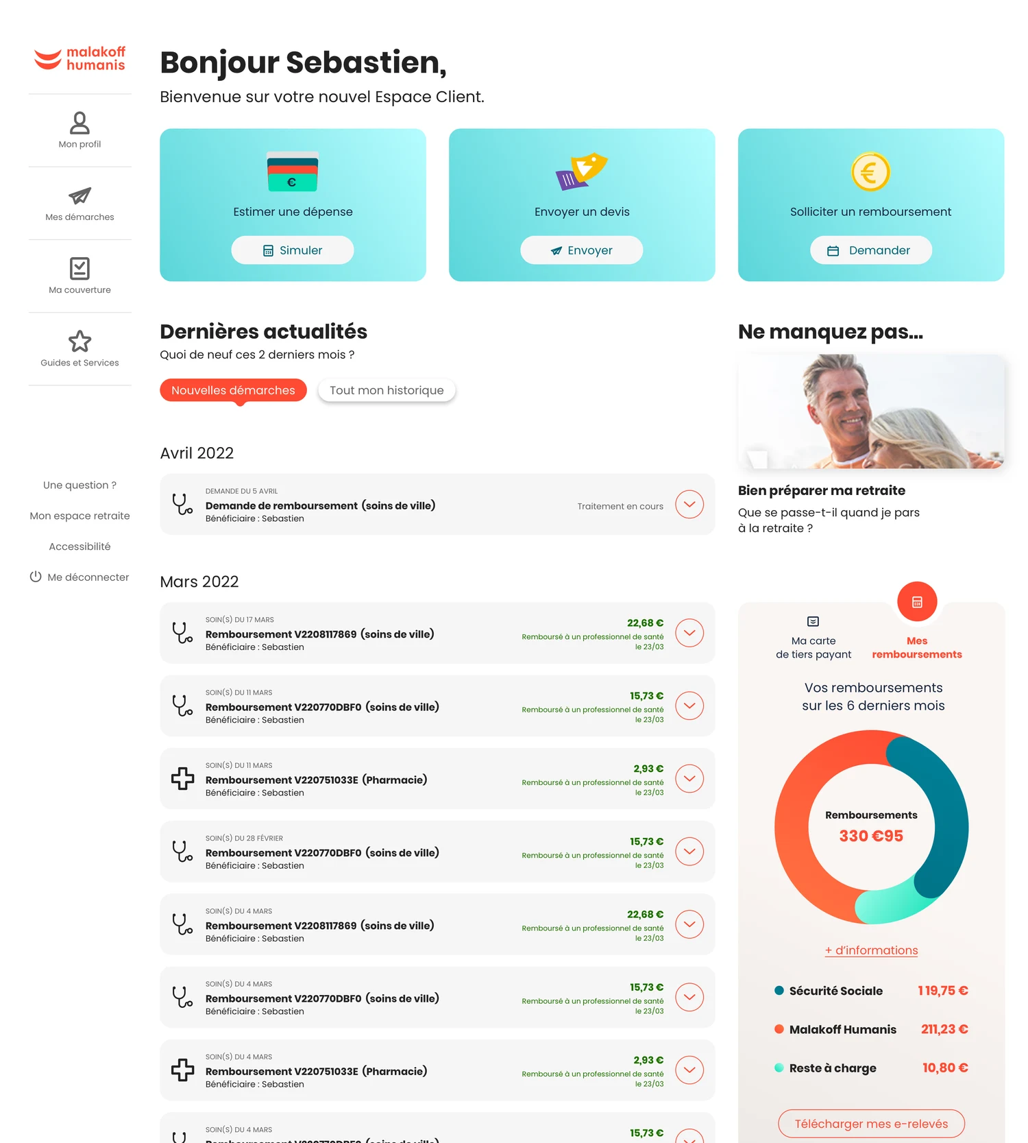
In the tests I ran, members wanted to identify the treatment, see what French social security and Malakoff Humanis each covered, and understand what they still owed. On mobile, they looked in particular for the amount reimbursed. I worked on making the headline amount quick to find on mobile and giving members a fuller breakdown on desktop. The redesigned flow went live.
UNDERSTAND BEFORE DESIGNING
Tell members which document they need.
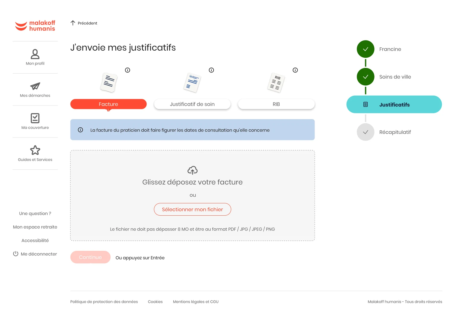
An invoice, proof of treatment and bank details each have different requirements. I put the requirements where members would see them before attaching a file or photo.
UX approach
Journey analysisFind where uploading fits in the member journey.
Member task mapMember dashboard
Check a reimbursement
Start a reimbursement claim
Track a claim
What needs to be clear before upload
Which document is needed?
An invoice, proof of treatment or bank details.
What information should I check?
The requirements depend on the document.
How can I send it?
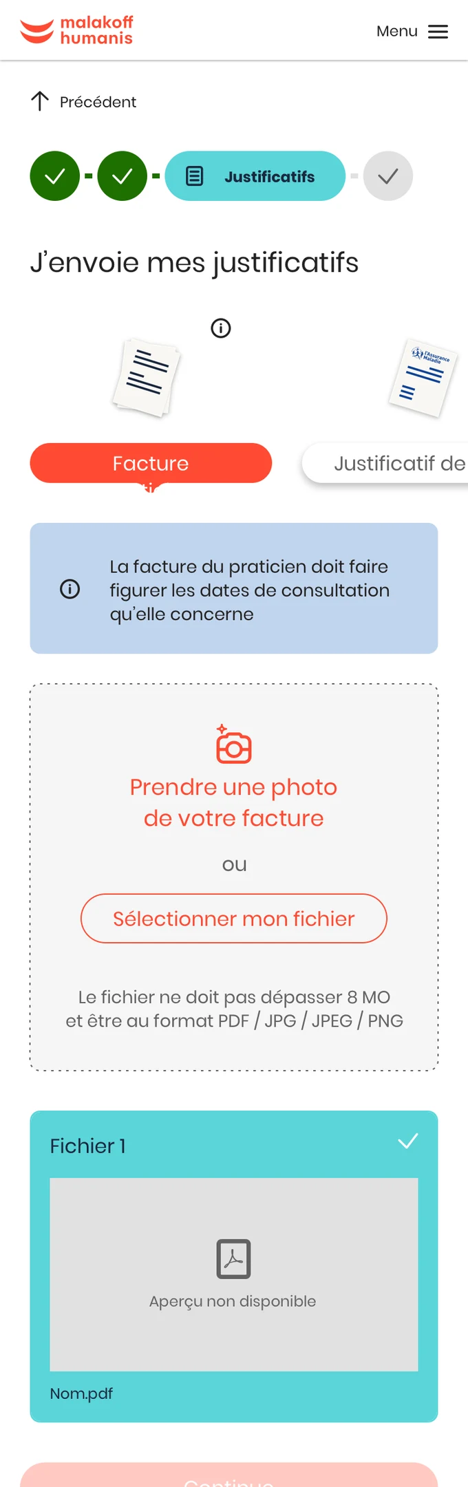
Upload a file or take a photo on mobile.
Order of actionsChoose the document, read the instructions, then attach it.
The document selected determines which instructions appear by the upload area.
Choose the document
All three document types are visible.
Read the instructions
The required information is stated before upload.
Attach the document
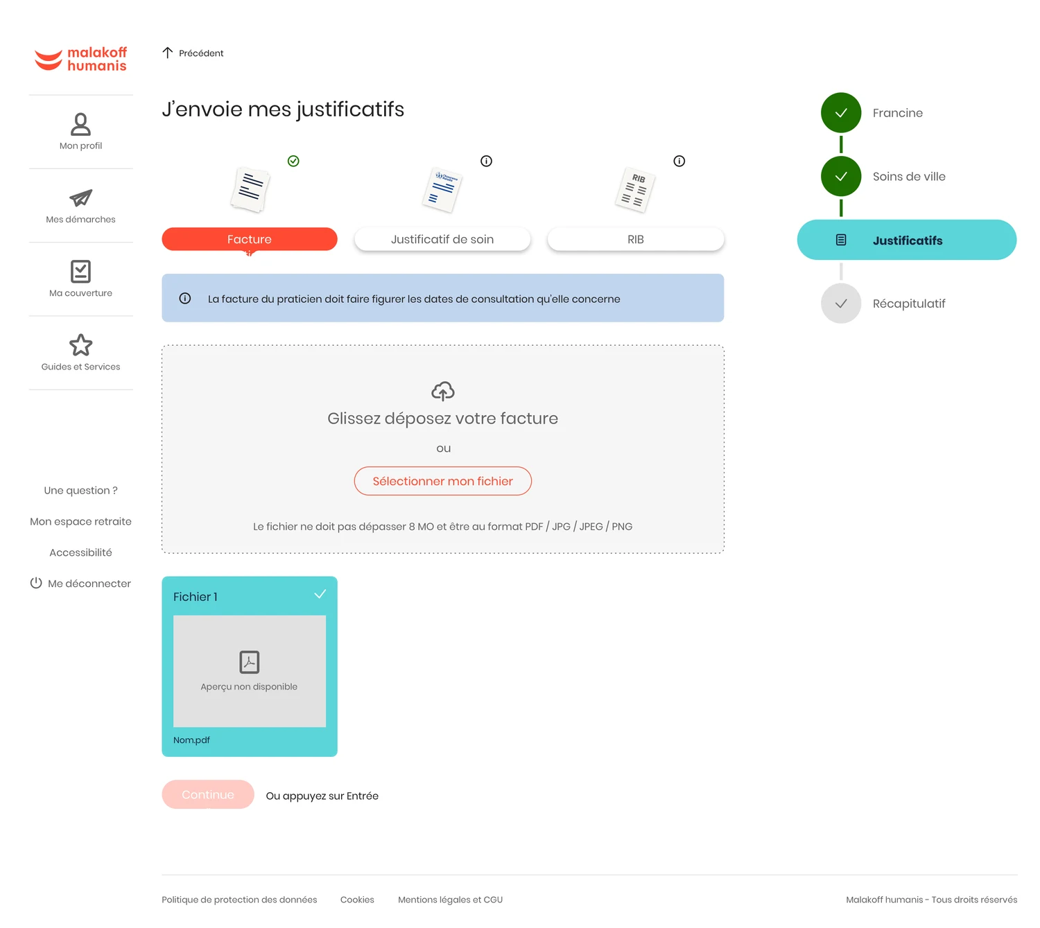
Add a file or photo in the same view.
WireframesTwo states of the same step.
Supporting documents
Which document should I add?
InvoiceProof of treatmentBank details
Upload area for the selected document
Identify the right documentThe document types are visible from the start.
Supporting documents
Upload my invoice
InvoiceProof of treatmentBank details
The invoice must show the dates of the appointments.
Upload the invoice
Invoice attached
Check and attach the invoiceInstructions come before upload and the attached file stays visible.
One document or several, two ways to guide the upload.
The signal. Frequent calls to customer support prompted the review. Comparing the live flow with the designs revealed two issues: no confirmation icon after adding a file, and a selector that appeared even when there was only one document.
My decision. I worked with the team to group each document with its instructions and upload area. When only one document was required, the prototype used a heading. When several were needed, “Next” guided members to the next document.
Review and delivery. I presented the prototypes and involved the Product Owner and business analyst in the feasibility review before UI design. The team shipped the approach and continued to refine it.
I prioritised common tasks. The reimbursement card opens a new request, while the history and status information let members return to an ongoing request.
2 views · Mobile and desktop - swipe or use the arrow keys
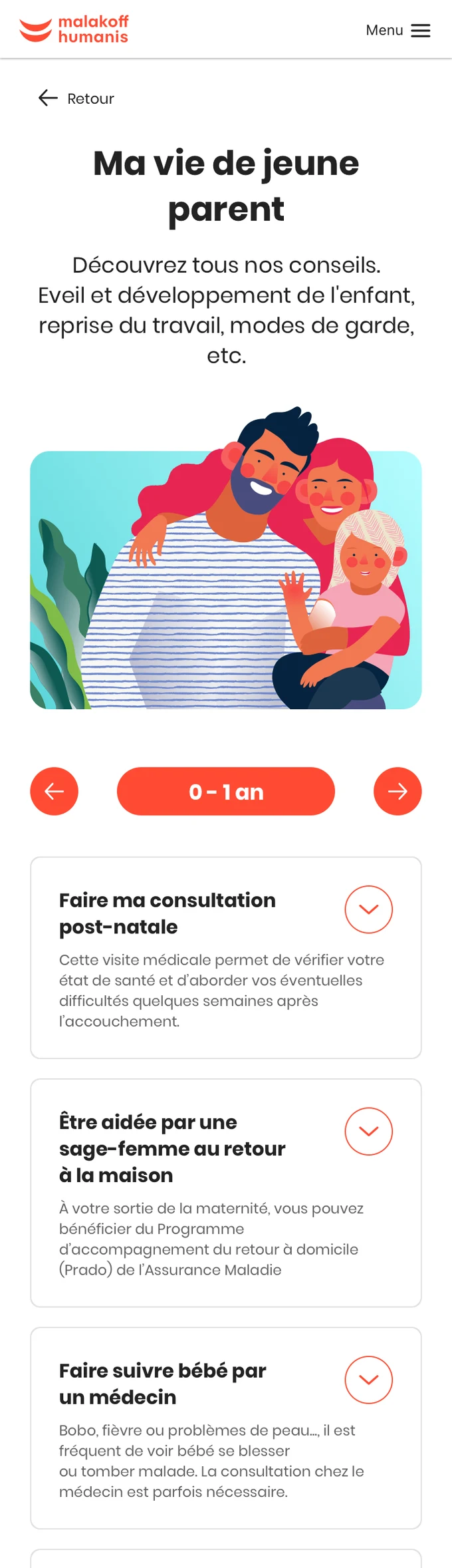
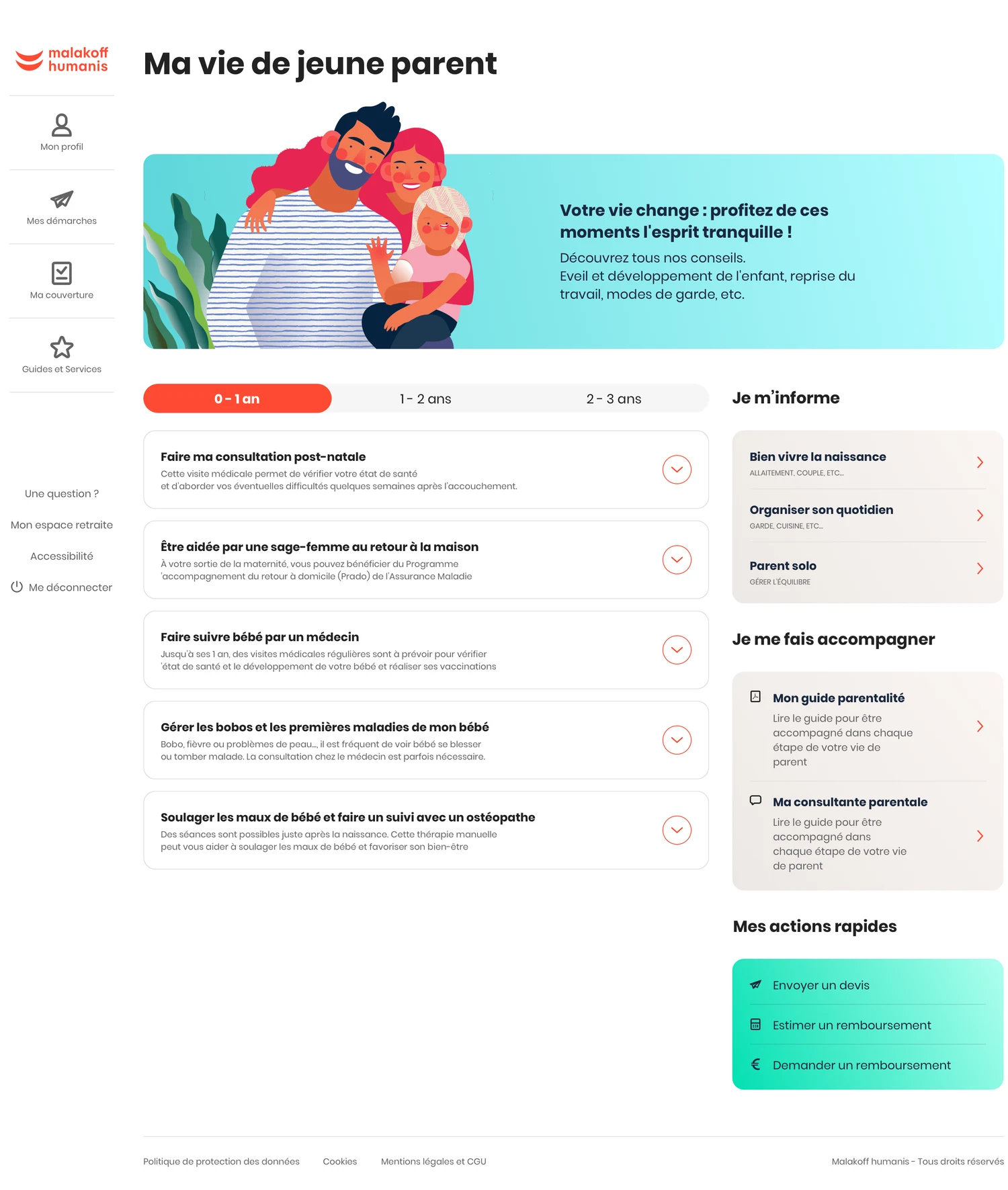
I organised advice, tasks and services by the child’s age, using life context as the starting point. The same structure carries through to desktop and mobile.
2 views · Mobile and desktop - swipe or use the arrow keys
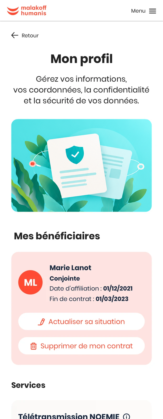
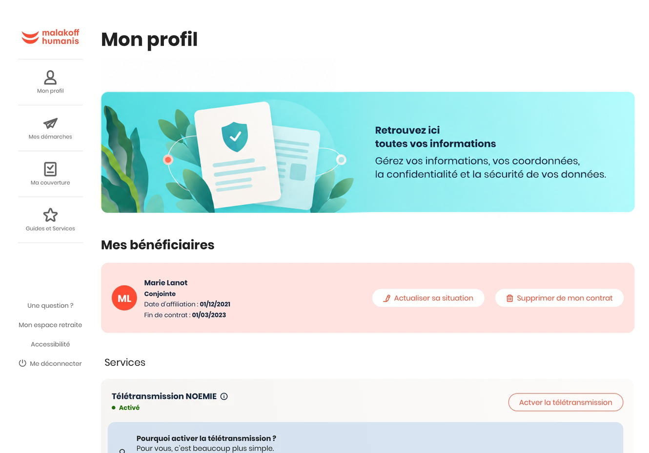
The profile brings together beneficiaries, services and contracts. I separated information to read from actions to take, keeping each status close to what it describes.
2 views · Mobile and desktop - swipe or use the arrow keys